Monday, November 26, 2012

It's Been One Wii-k

That's right. I went there.


  The Wii U has been out for a week, and I've already started referring it to the Wii, having pretty much phased the original console out of my head. Fact of the matter is this: Nintendo has caught up to the whole "HD Console" after 6 years of leaning on the Wii for as long as it could. In a single week, library of games not withstanding, it has completely surpassed it's competition.

  Granted, with 6 years of planning, every failure would weigh them down infinitely more. Every "negative" is much heavier reason not to get it in this current environment. Where the longevity of the system lasts as updates to the XBOX and PS3 arrive is big cloud in the sky. However, one look at the market for iOS and Android games and the way they're being moved to the big PC with Windows 8, and I think you'll see that the trend here is moving away from power-hungry machines, and more or unique experiences. And with history as my only source, Microsoft and Sony are more interested in an arms race with the same old thing. Where the Wii was, in all fairness, a gimped experiment hamstrung by an effort to move away from high-cost consoles, the Wii U is a perfection on the Wii's attempts at bringing the new. Historically, consoles are always about either evolution or revolution, but the Wii U manages to strike both.

In case Nintendo's incredibly vague marketing has you confused, yes, it's a new console, not just a new controller.

  Evolution comes from the improvements made in the realm of things that are a staple of modern online connectivity. When the Wii came out, nobody hard heard of an iPhone store, and even Steam was only starting to pick up... well, you get the idea. Digital storefronts were pretty weird and clunky all around, so it was easy to settle with Nintendo's hat-in-the-ring. Also that Wii shop channel music could calm a charging rhino. With the Wii U we have a much smoother interface, but like the 3DS, there's still an issue of just wanting the ability to browse based on categories.  It's easier to get what you want and go, and at the end of the day you either check it obsessively like me or you wait until somebody tells you to get the bestest new game, and then you just go find it with the search. On the downside, WiiWare and Virtual Console titles are still tucked under the "Wii Channel," which straight up boots an emulation of the Wii, and forces you to go into the Wii Shop Channel to find what you want. It's clunky as hell. Considering how easy throwing GameCube games in the Wii was, I'm surprised they went so weird this time around. Also, when the DSiWare evolved into the 3DS eShop between generations, everything in the DSiWare rolled into the new shop. That is not true of the Wii U eShop. Here's to hoping that with a unified account system being found in Wii U's Nintendo ID, we can move towards something cross-platform, akin to Sony's excellent dealings between the Vita/PSP and the PS3 with the Sony Network. It wasn't right to have to buy Super Mario Bros. on the 3DS when I have it on the Wii, and as time goes, it's less and less excusable to continue that kind of practice.


  I also wanted to mention that the fact that you can buy almost every retail game that comes out on Wii U in both a digital format as well as the standard physical is amazing. It's finally time people started catching up to services like Steam, who even then usually has to wait for some releases to finish making a PC port after the console launch. I don't foresee myself buying anything more than I have to in physical formats. Now you might be one of those "I like everything on the shelf," type people, and that's cool, I get that. But that doesn't take away from the fact that Nintendo, who had a bare-bones online presence with the Wii and DS, has suddenly caught up and blown the other guys out of the water. Sony getting a Day 1 digital release was cause for headlines at IGN. Now it's an every day thing, thanks to Nintendo's push.

  The Wii U has tons of other neat features like a browser that you can access while your game is paused. As somebody who is dumb and likes to Google the answers to Subject 16's puzzles in Assassin's Creed, or the day-to-day guide for unlocking your social links in Persona 4, I bloody love this. The 3DS has it, and I know from experience that it's useful. You can also access TVii here at some point, which promises the ability to meld all your streaming services and TiVo together, but that feature's not up and running just yet. I think, once it is, the Wii U will be the only console you want to experience streaming media on. That is, of course, unless you're already using it for that.

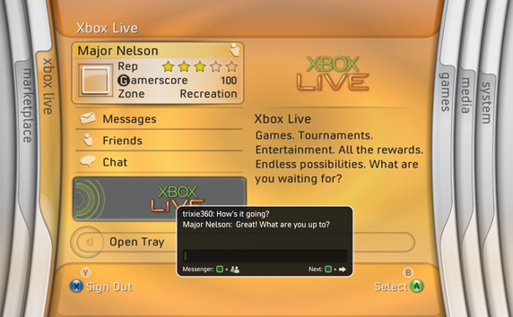
  I'll readily admit that I stopped using XBOX's ridiculously degenerating interface. Combined with requiring me to pay to use my XBOX to stream Netflx and Hulu, despite them being free to stream on literally every other device in existence, there was just nothing left that system could offer me. Achievements don't mean anything when it's that much weaker and plays the same games as my PC and PS3.  Admittedly, I never had a problem with the PS3's interface, but let me tell you, there's something about that GamePad that just works. You only need the pad, because it doubles as a universal remote, making the process of setting up your nightly Star Trek: TNG session that much easier. Technically, you don't even need to do that if you're interested in just watching Netflix on the GamePad. It seamlessly transfers from big screen to little screen, which is great for when you're sitting at your computer away from the TV. I suppose if you had kids it could be useful to keep them off the big TV. Or (and let's all be brutally fucking honest here, people) if you're on the toilet and you don't want to stop watching 30 Rock.


  Let's talk social, because the Wii U just may have done it the best damned way possible. The XBOX has taken great strides for online play with your friends, and admittedly they still do it best. What the Wii U does do, however, is create a sense of community around it's games. When you boot the Wii U on, your GamePad hosts the Wii-like tile menu, while your screen is overrun with Mii's surrounding game icons. Each one of those Mii's is another person out there in the Nintendosphere, all of whom leave comments on each game's Miiverse page. Miiverse is kind of like Twitter, Facebook, a little bit of DeviantArt, and Reddit all rolled into one surprisingly cohesive package. Except here, the people are (generally) better, there's no advertisements, and nobody can ruin your day with downvotes!

This is what happens when you say you liked Mass Effect 3's ending on Reddit.

  You can load up the Miiverse and search for a game you like, or a game you're interested in. On that board, you can view posts based on tags, or just run down the list to see what's up. There's conversations taking place, people can post screenshots directly from their games, and you can even leave drawings or hand-written messages. It's insane the amount of talent people have been showing off in the Miiverse. Tons of sketch art and scratch art for all your favorite games. You can follow anybody and see whenever they post something, so if you've picked up on a few awesome artists, you can catch every surprising masterpiece they post.

  The Miiverse doesn't just stop at being it's own thing, though. It can be implemented into every and any game. In Nintendo Land, it's there to talk about what you thought of a game or post your high score. In New Super Mario Bros. Wii U, it will pop up during certain benchmarks to ask you to express yourself, sometimes in colorful ways. It's going to be a non-issue for some people, but I find it really enjoyable. And whatever moderation Nintendo has is doing an alright job. I've only seen one poorly drawn scrotum all week! Once the Miiverse hits mobile phones and PC, I honestly seeing it be the answer to Facebook for people who just like games, and as a way to keep up with what your friends are doing. The only other competition would be Steam's new community that's only been around for a couple of months. With a few more improvements, and a couple of firmware updates, there's no reason Miiverse couldn't continue to grow into something, well...


  My only real beef with the Wii U itself is that they've seemed to take up Sony's plan of being slow as hell whenever you get a new game. Never mind the hour-long "Day 1" download, booting up a game that needs any updates installed is way more painful than it needs to be. We're talking upwards of 5 or 6 minutes. I'm hoping something down the line will help ease those installations because they are rough.

  Something that's going to make the Wii U a tough sell to a lot of people is "I've already got a PS3 and/or Xbox, why do I need this?" I don't know what it will take to convince you to get one. What it comes down to is this: Nintendo consoles have always been seen as only profitable for Nintendo. The Wii U changes that. There's no reason not to port anything on the Wii U. There's no weird tiny discs, there's no technological ravine between it and the other consoles, and the digital front is heavy. You're already making games for XBOX and PS3, just throw in another port. On top of that, the Wii U is superior in both hardware and software to the XBOX. At this point it's PS3 and Wii U to get your bases covered. If you're one of those people who has just condemned themselves to a life of thinking "I don't like Nintendo or anything they do," well then there's really nothing that can be said to convince you otherwise. I can tell you why it's great, but you'll find an excuse not to believe me. And that's true of any console, not just Nintendo.

This is how I imagine anybody who uses the phrase "fanboy" to try to win an argument.

  There are more ways to play games, better ways to stream videos, and awesome ways to connect with your friends and communities. There is a lot of potential here. With the new consoles from the other guys inevitably on the future, I'm curious to see what all happens in the next year or two. Even just looking at the horse power behind my computer and my XBox and PS3, I'm positive we're not going to see -that- drastic of a tech shift; the Wii U will not be another Wii. Plus, with more "normal" ways of gaming, it'll be easier to convince people to make games for the system. The Pro Controller bridges the gap between the Wii-Remotes craziness, and the fact that only one GamePad can connect to your system. I think the longevity is there, but it's really dependent on how Nintendo continues to evolve the platform. Also looking ahead, don't be surprised to see Sony try to integrate the Vita better, or to see Microsoft's push it's "Glass" down your throat just as much as it does Bing.


  If I sound like I'm overenthusiastic about the Wii U, it's because I probably am. Maybe it's this new Bupropion I'm taking, but I really do like this system. I won't deny my love of Nintendo, but there are two things to understand about said love. 1: I give everything a fair shake and a fair chance. I really do. Ask me about the Vita, I'll tell you I absolutely love the thing. 2: There's a reason I love Nintendo the way that I do. They can be the most infuriatingly stubborn company, but when they want to do something, and really get it right, nobody can do it like they do. And while the technology might not be 100%, and a new console should probably happen sooner rather than later to stay 'caught up' with the competition, I think the Wii U really is a new way of playing, and for the better. It's versatile in a way that no other console is. It's 'new' without being something so drastic as just the Wii-motes. It is, at the risk of sounding hopelessly glassy-eyed, the future.


  But hey that's just me. Do you have any questions about the Wii U I can maybe answer? Do you have your own thoughts on your console? I'll be talking software down the road here, I wanted to focus more on the 'Out of Box" experiences you'll be having for now. I've spread myself a bit thin on games... 6 on the Wii U alone, not to mention Paper Mario: Sticker Star, Persona 4: The Golden, Professor Layton: The Miracle Mask, Virtue's Last Hope, Crashmo and holy fucking hell I need to stop buying games. I also need a month or five off of work to catch up. Hopefully this all means I"ll have more to talk about, as more game-specific discussions (let's not call them "reviews," per se) will start coming down the pipe. I look forward to conversation!

Oh and look, I have a Twitter account! Aren't I novel?

-Randy

Wednesday, September 19, 2012

Critiques, Reviews, And The Brothers Mario

The difference between critiques and reviews, how the games industry fails at both, and how New Super Mario Brothers 2 just might be the worst best game I've ever played.


  A teacher once asked me what the difference between craft and art was, and at the time I had no reference to consider the answer. To me, they had always been the same. It's called Arts and Crafts, right? The answer was something that stuck with me, and it's where I find the difference between reviews and critiques. And Nintendo's recent return to 2D platforming, New Super Mario Bros. 2, teeters in this nebulous place that makes it hard to determine just how "good" the game is.


  Crafts are something you do as a profession. It is your job to do them. You do them to make money. That's not to say you can't put your heart into a craft, or that your craft can't also be an art. But the idea is that it's something you hone, and something you can do to make an incredible product that others can then take and consume. To me, you review a crafted product. Now certainly, you can critique a craft to an extent, but even then you're doing it from a mechanical perspective. To me that's more of a learning experience than a proper review. To that extent, New Super Mario Bros. 2 is a perfectly crafted game. There is not a single part of that game that was not meticulously looked over to ensure that everything was just right. Each level feels relatively unique, and overall the packaged game was presented in a vibrant way that was easy for anybody to pick up and enjoy.

  Art is something you do for the sake of passing something along. Perhaps it's a message, a feeling, or an emotion, but it's something you do for yourself, and then maybe you share it with others to get that idea out there. In this regard, it's not that New Super Mario Bros. 2 is bad, but it's mostly devoid of anything special and personal. Sure, I still get a chuckle out of the pantomimed opening and closing videos, I still possess a lust for coins and 1-Ups, and I still just love the feeling of finding a hidden place in a level, but these are the result of their finely tuned craft. From an artistic side, and even a critical game design side, there's not much hear that screams "magic." I'm aware that not every Mario game has been in search of that magic, and certainly there's nothing wrong with simply making a finely tuned game; that's how the series started after all. But when you look back at Mario Bros. 3, Super Mario World, Yoshi's Island, Mario 64, Mario Galaxy, and even Mario Sunshine, there was a clear attempt at passing curiosity in the well-crafted games. They had these unique mechanics designed to help you explore these hand-crafted worlds. Those games are the culmination of brilliant craftsmanship and artistic credibility melding together into unforgettable experiences that are regarded as the best in the industry for a reason. New Super Mario Bros. 2 doesn't have that feeling, and is perhaps the Mario game most devoid of any spark. So how do you convey this, and what's the best method of doing so? Do you review NSMB2 for it's brilliantly executed gameplay, or do you acknowledge that it's a great game and time-passer, but critique it for the lack anything that makes it special beyond that? I think you need to do both, and you need to do them separately.

  The words critique and review are synonymous in most dictionaries and thesauruses, and on the surface level they basically mean the same thing. From a technical standpoint, however, a review is about the "what." What worked, what didn't, what is this game, what does it have, and what does it do. The purpose of a review is to tell people whether or not something is worth their time and money based on what it is. I have always been of the opinion that reviews should be less of an opinionated piece, and more of an objective examination of something. If I wanted a review of a product, I would go to Consumer Reports. They try out a product and tell you what's good, what's bad, and whether you should have one, and it's done from a very tested and mechanical standpoint.


  A great example of how to do a review wrong can be seen on IGN's review of Double Dragon: Neon. In the very first paragraph the reviewer makes a bold, obviously personal claim that the era of beat-'em-up's is dead, and that Double Dragon: Neon is a failure out of the gate for adhering to that. That's not a review, it's not even a critique, it's an opinion piece. And a bad one at that. He's allowed to hate beat-'em-up's as much as I hate real time strategy games (because I suck at them), and you're totally cool to agree with the statement, but saying it like it's the truth is like saying Tomatoes are a dead fruit because you don't like them. They're dead to you, sure, but you are not everyone. This article does absolutely no service to the consumer that is trying to decide if this project is worth their time. The fact is, Double Dragon: Neon does exactly what it sets out to do by paying homage to the arcade games of old, and it does it damn well. That's what a review bi-line should look like for that game, because that really cannot be argued. Now, it can be argued how well it does it and whether it could have been done better or worst, but in the end it was made exactly the way it was meant to be made. The hardest thing to remember is that you disliking a game does not mean it is a bad game. It means you don't like it; nothing more and nothing less. Not realizing that fact is what makes this a bad review.

  Conversely, a critique is about dissecting a game; they're about the How. How well are a games mechanics implemented and operating, and how does the critic feel they could be improved upon or avoided in future productions. How well does the developer pass along the desired emotions or feelings. (Remember: fun is a feeling!) Overall, it's about how the game did at it's mission statement, and how it can be improved. This type of writing is meant more for the developer, as well as other developers looking to improve their own games, than it is the general public. A critique isn't necessarily black and white as far as "well this could have been better with X," but it's based on reasoning and theory, not just mindless assumptions. This is an area that I feel like the industry lacks. There's not enough critiquing of the work of developers designed for developers. Instead, what happens is sites like IGN and Kotaku are trying to critique games to the people who buy them, which creates a mismatched environment. Reviewers put too much of themselves in a review, but they don't put enough thought into how things can be improved either. What you have lies between a critique and a review, and isn't terribly useful to the consumer or the developer. So if it's not for either of them, who is it for?


  The reason I don't tend to read reviews in their current form on major sites is that they don't have any value to me as a consumer, or as a budding developer. Sure, a lot of reviews will tell me if a game is straight broken or not, but for example, I don't care what Jeff Gerstmann thought about Borderlands 2. I appreciate that he has an opinion, and admittedly I always love discussing thoughts on games. However, these are 1-directional monologues with no room for diatribe. Whether or not he's burnt out on the franchise shouldn't matter in a review. Maybe I am, too, or maybe I'm still hungry for more. So knowing that he's full of Borderlands doesn't help me decide whether or not to buy it. Now, saying that Borderlands 2 is "more of the same" is a valid review point, how that affects him is irrelevant because he's not the one purchasing the game. I am. And like anybody else reading that review, there's no reason the way he felt about a game should have any influence over the way I will feel over it. So what is the economical value of him including it in a review?

  Let's go back to New Super Mario Bros. 2.  This game is technically and mechanically flawless on every level. It works beautifully, it runs at a solid 60 frames per second, your objectives are clear and the gameplay is varied. There's nothing wrong with this game, from a strictly technical and gameplay perspective. However, if we want to work at the deeper side of the game, there are questions to be raised. How does the "collect a bajillion coins" mechanic really add to the experience? Making coin-lust the center focus on a Mario game is a great idea, and it's executed fairly well, but there's no end point to it. Also, you still have the life counter, which still grants 1-Ups based on collecting 100 coins at a time. In a game where you are literally getting showered with hundreds of coins per level, that life count makes even less sense than it ever has. Losing all of your lives hasn't been more punishing than it was back in the original Super Mario Bros., and yet the mechanic lumbers forward into the present without purpose. Overall, this is the type of thing where the game could improve upon, but doesn't subtract anything from the otherwise perfect experience either.

  The conundrum here is how do you attach a number value to a game like this? I totally enjoyed my time with it, and it was an excellently crafted product, but I notice that it feels more hollow than previous installments. It doesn't have that spark. How do you decide whether or not this game is 'fun,' and with what confidence do you believe others will feel exactly the way you do? What is the numerical value of fun, and how much fun is too much? How high does the fun score have to be before your own fun is validated? How the fuck do you answer these questions and not sound like a totally crazy person?

  These are questions that I think "games journalists" and "critics" need to stop trying to answer. The only person who can decide how fun a game is or how good a game is, is you. Results may very, but in the end, the quality of the title published shouldn't be viewed terribly differently from person to person f they're looking at it objectively. Until we get to that point, current "games reviews," are no different than reading somebody's forum post; they're just much more competently written. Usually.

  What do you think, reader? Is there a difference between craft and art in video games? Do you think Reviews and Critiques are fine blended together in their current form on most sites? Do you have a better way of the whole system that even I haven't thought of? Please, feel free to discuss in the comments below.


Thursday, September 13, 2012

Unplugged - Penny Arcade: The Game: Gamers vs. Evil and Rumble in R'lyeh

A great game that might not be worth the price of entry.

  As a big Penny Arcade fan, it's hard not to jump at the chance for a game made by them. The duo of Gabe and Tycho know games inside and out from both the creative and the player side of things. I know I can expect interesting things from their unique brand of know-how and humor. Penny Arcade: The Game and it's stand-alone sequel/add-on is a distinct opportunity for them to draw from a rich history with their comic to combine fan-service with a unique deck-building game. I just don't know if you really get your money's worth for it.


  Penny Arcade: The Game: Gamers vs. Evil is a fairly simple game. Each player chooses a hero card from an assortment of Penny Arcade characters, including the dysfunctional duo themselves, as well as all your favorites like Carl from "Automata" and Tycho's niece, Anarchy. Everybody then starts off with only a handful of quarters and cardboard tubes that they then must use to buy or defeat enemies, to build up a deck that they can use against the bosses. Each enemy can usually only be bought or defeated with a cardboard tube, so you've got your green and red decks to reflect that. There are bosses that can be defeated, which is the best way to win, but it's not the only way. Most enemies that are fought with cardboard tubes yield Victory Points, so if you focus enough on them, you might be able to win without ever touching a boss. The bosses give loot with a large chunk of Victory Points, but they're harder to defeat. Also, if you overdraw from the enemy decks, the game is immediately over and the player with the most Victory Points wins. This makes a unique strategy that keeps all players balancing the rush to down the bosses, while making sure their enemies aren't just trying to end the game with a lot of little victories.

  It feels like the instructions do a very poor job of explaining this premise to you. They feel like they're explaining the game out of order and from the perspective of somebody who doesn't know how to give very good demonstrations at a convention. It's not until you actually start playing, so you can reference the different sections of the manual out of order, that you get a sense for how to actually play the game step-by-step. And when you're looking at the cards, it's hard to immediately discern what cards do what. The boss loot shares the same picture as the boss cards, but they look like monster cards, and each monster stack has a red-backed version of itself that goes in a completely separate deck for randomizing what monsters you fight that game... It all works when you finally manage to piece it together, but there really feels like a lack of clarity that could have been fixed with some additional card border colors, or clearer markings, and a much more well-thought out instruction manual. Once you're actually into the game, however, it's actually an incredibly easy to play, yet subtly strategic game.


  There's a lot going on in terms of what you can do. Each turn, you draw 6 cards, and by the end of your turn you'll discard them all. This urges players to play fast and hard by spending everything they can on buying and defeating monsters (with coins and cardboard tubes, respectively). By purchasing or defeating your enemies (which is the same thing, really, just with different types of cards), you put them into your own discard pile. This assimilates them into the deck for further use, allowing you to do more complex maneuvers, as each type of monster card has it's own abilities. Some make you add Pax Pox cards to your opponent's deck, which are essentially drawing dead weight cards that have no effect whatsoever, while others allow you to spend more tokens or cardboard tubes than you normally would be able to. Once your deck is exhausted, you shuffle up your discard pile and keep going with all your new gains. It's really quite exhilarating, but also makes for a more fast-paced affair than something like a Catan or a Munchkin.

  Penny Arcade: The Game: Rumble in R'lyeh adds more of everything in the first game, while itself containing enough to be it's own title. More monsters, more hero cards, and more bosses can be mixed in with the original, or played off to the side, but it also comes with a unique Gold Card mechanic. A third row of cards that are almost boss cards themselves, requiring a divide of quarters and tubes to defeat, but also yielding higher rewards. The best thing about it is that it allows you to play with even more variety in your randomly-generated games.

  Overall, I'd say this game is an absolute blast to play (for up to 4 players), but the package falls short when you start talking contents versus price. When you open the box one one of these, there's a great deal of emptiness that gives a knee-jerk "I just paid for this?" reaction. It's easy to see that their goal was to allow expansions to be added in, so they made a bigger box with a lot of free room for exactly that. Throw in the knowledge that the second game would be stand-alone, but could also be mixed in, and it makes sense that they'd come in equally big boxes so you can combine them if you want. But it doesn't defeat the fact that opening that box for the first time is a bit disheartening.

Remember: this is two-games put together.

  At $45 each, what you see above is $90 (plus tax!) worth of goods. Comparatively, it's not up to snuff with the contents of a $25 dollar game of Munchkin, or even a $60 dollar game of Arkham Horror. Arkham may have a high investment capital, but there's a ton of cards, pieces, and a giant board, all intricately designed and all very high quality. It's hardly worth it even compared to the original Penny Arcade: The Card Game that Fantasy Flight published, which itself was just recycled art and mechanics from the Penny Arcade decks from the Vs TCG. 

  I would rank the cards for this game, which mind you are the only things you get other than a d20, are among the cheapest cards I've ever played with in a game. Knowing Cryptozoic, the game's publisher, has done some fine work the World of Warcraft card game, I was let down by the lack of quality out of this package. It's mostly recycled Penny Arcade comic artwork, the 'interface' of the cards feels wholly undeveloped, and there's none of Tycho's distinct writing (outside of any text that may appear from the comic.) Nothing about this game feels like the Penny Arcade team had any work to do for it other than designing the (admittedly awesome) box covers. There's not a lot of "Wow!" in this box beyond "I remember Rex Ready... those were pretty funny comics." So just what am I paying $45 a box for? I hope I'm wrong in thinking that it might be solely for the fact that this has Penny Arcade in the name.

  What you have is a great core game, and some appreciative fanboy happy-sauce, but overall I just can't get over the fact that it feels cheap and unfinished. For $45 I can get Cards Against Humanity and it's two expansions, which at least has the excuse of feeling cheap because it was a Kickstarter project that was made as cheaply as possible so that it could exist at all. I never have a problem paying a lot for a game, but I need to feel like there's a reason I paid that price. As much as I like this game, I just don't get that feeling.

Friday, July 6, 2012

User Interface Week - The Nintendo Brand

Customization is key

  The base Wii Interface is an entirely simple, yet strangely gratifying experience that allows users to set up their products in a way that they find aesthetically pleasing..

  One of the things that works best for the Wii's interface is the Wii Remote itself, serving as a near-mouse interface and allowing you to point and click at exactly what you want. A D-Pad could work for this interface, but it would require a lot more navigation to get anywhere, although the grid-based set-up would help make navigating to the program you want more simple. Anybody who has used the analog stick of a Classic Controller to navigate it knows that method is simply not what you want to be using, but it's nice that you don't have to switch up to your Wii-mote when swapping between SNES games.


  All a person has to do to move the icons is pinch the A and B buttons together on any tile (except the main Disc Channel) and move it wherever you want. This drag-and-drop functionality allows for some great organization for a clutter-minded person like myself, but the absence of folders really hinders it. Combined with the fact that the Wii itself can only hold a very small amount of data, and you have kind of a limited use for that an interface designed to show off your inventory of games. The addition of being able to access games stored on an SD Card helped, but you have to go into a secondary menu for that, making the main screen all the more barren.

  One of the things that really endears the interface to me is that the icons can have little animations to them. The Virtual Console ones kind of wasted that potential, just showing the title screen and what system the game was originally on, but original software plays with this in interesting ways. One of the reasons I keep Dr. Mario Rx Online on my main page is just to see those little viruses from my childhood swarming the icon. I also keep Cave Story because I like the scene of the clouds scrolling buy under the moon. It just looks nice.  Also, when you click on the icon, you're treated to an audio queue and little animation (except, again, with the Virtual Console games) that serves as a prelude to your experience. It just makes the whole experience that much more charming.

  The settings are fairly easy to navigate, although being able to get to the system memory to remove and transfer games and applications needs to be easier. Given the system's limited memory, and back when there were games I wanted coming out of the Wii's download service, the tradition of 'cleaning out the fridge' was made all the more painful by having to dig deep into menus to uproot the games and remove them from my system. 

  One of the Wii's big designs was to have other 'apps' take on a more browser-focused set-up, including the Wii Shop. It's not so much that Wii Shop has a bad interface, although it is painfully simplistic. But holy hell it is incredibly slow. When an interface is supposed to be snappy, the way that marketplace was set up is anything but. The attempts at categorization are nice, but need a little bit more expanding upon. This is a rare instance where there actually needs to be more menus for the sake of more accurate navigation. For example, when I want to look at Super Nintendo games in the Virtual Console shop, it only requires the least number of logical clicks to navigate to the section... but then you have to sort through each game in alphabetical order to get to the one you want. And considering 95% of Super Nintendo games started with the word "super," it's absolutely grueling to get to the game you want. An alphabetical categorization would have gone a long way to help with that, allowing you to select the letter your game starts with, at least. Although being able to search by name from the get-go helps if you know what you're looking for without digging around. It's terrible for browsing and impulse buying, but if you know you want Mega Man X2, jump in and grab it. 

  It would seem that Nintendo has learned a lot about what people want from an interface with the 3DS. It has the capability to organize the applications in a row of icons like the Nintendo DSi, or pages of icons at once like an iPhone, all thanks to the amount of on-the-fly customization options.


  I want that "2D image of a Nintendo 3DS game" on a t-shirt. Or all pictures of me on Facebook should say "a 2D image of a 3D person." Random musings, sorry.

  Anyway, what you see here is the default interface when you boot up a 3DS. The top screen is just for shiny pictures and information, but the bottom can be navigated via the d-pad and face buttons or with the stylus. If there's one thing I love in an interface, it's options, and this allows you to really set up your screen into something you're most comfortable with. In the top left corner is an icon of a big box and 4 smaller boxes; with those two buttons, you can basically cram more or less icons on your screen (obviously changing their size in the process). Myself, I have it set up similar to the Wii, with 3 rows of 5 columns. Simply hold down the stylus on an icon to pick it up and move it wherever you want. With a recent update to the firmware they added the ability to sort games into folders, making everything that much more organized. Now all of my Game Boy, 3DS Downloads, and NES games are in their own folders. Deleting games and removing icons is still a hassle, but I think Nintendo is doing that on purpose to make it harder to remove games you can potentially play, or to keep people from removing them on accident. That's just my guess, though.

  The shop interface is much more wieldy and snappy than it's Wii and (more so) DSi predecessors, and I appreciate the "recent arrivals" right there on the left. Since I check this thing weekly, it's nice having everything new right there for a quick glance. If there's one thing the store needs, however, it's the Wii's categories. As it stands, the Virtual Console just has games kind of dumped into it with no way to find, say, Game Boy games specifically. There's also no way to sort out categories like just 3DS-specific titles or DSiWare titles. However, just like the Wii's, if you know what your'e grabbing, that search bar makes it easy enough to just grab it and get out before getting lost.in a sea of mediocre DSiWare titles. So it still has a lot of room to grow into a more friendly browsing experience.

  While the overall interfaces aren't perfect, the amount of customization Nintendo is adding to each piece of hardware is only getting better. Hopefully they can continue to improve on these ideas of organization and categorization. They could learn a bit from the Android's interface to really make something clean and user friendly, while still having that undeniable charm that only Nintendo can do.

  What thinks you, reader extraordinaire? Are you as obsessed with interfaces as I? What do you look for in a good interface? What operating system or console has your favorite? Comments are appreciated below, as always!

-Make it a good one.

Wednesday, July 4, 2012

User Interface Week - Evolution of the XBOX

When good ideas go bad.

  I'm not going to mince words here: Microsoft's console experience has been an exercise in alienation, confusion, and burying content under needless menus. But just how did it get to such a state? Logically, the interface should be improving, right? Well, unfortunately, it's only been getting worse since it started.

The King of Blades


  I'm always blown away when I remember just how easy the original interface was. It was clean, simple, and snappy. A tap of the right and left bumpers moved you between blades, and you could navigate the individual menus to find what you wanted. Sure, when you actually dove into the Marketplace, it was kind of a nightmare. But actually digging into your media selections and navigating your game list was simple. Plus, you could activate your game from any of these blades. This was back when Microsoft remembered their console was a gaming system. I have nothing against them trying to expand it into other areas, in fact I welcome the idea, but the steps they've taken to get away from selling video games have become glaringly obvious.

The New XBOX Experience


  Now as much as I think the Blades interface was the best, I think the NXE (above) was my favorite. It was stylish, it managed to lay things out in an organized manner. It had it's share of problems, and a complete lack of customization really kept it from being what people would want it to be, but it was nice. It had potential; none of which was ever lived up to, unfortunately. But for what it was it was kind of a fun interface. Zooming along those menus had a tactile experience that made it subconsciously fun to navigate. Plus, all of my libraries were right there and easy to access. The Marketplace also received a considerable upgrade, at least until it all became Zune-ified. Then everything started to chug and take forever to load. That was the start of a bad way for the XBOX experience.

The New New XBOX Experience


  It wasn't so much of a 'total upgrade' as it was an 'upgrade' to help focus on Kinect interfacing. What it was was more boring, and only furthered to bury the content I was looking for. My biggest problem with this interface is the way they handled the games marketplace, separating games and content into weird categories, getting rid of the easy "Stuff that came out this week!" section and forcing you to go into each and every separate category. But while it was a downgrade from the previous exeprience, nothing could compare it to the current state of affairs.

The "We Hate You" XBOX Experience


  It's telling that Games isn't even the first thing next to Home, but is stuck behind two additional layers of virtually identical tabs. This is where everything just became awful. There's so much garbage here, and so many advertisements for paid members. The other systems don't even have advertisements for non-paying services, although they do offer a place where you can go receive game advertisements if you want them. This interface, however, just serves to hide the thing you want, in a pathetic attempt to expose you to something new. 

  I have spent less money on my XBOX since this interface came out than I've spent on my Virtual Console. The only things I've purchased at this point are season passes to shows like 30 Rock and Archer, because Hulu is a miserable service and I like to keep up to date. If Microsoft has improved one thing, it's their video services... once you actually figure out how to get to them, and how to purchase them. 

  The fact that they have a "Quickplay" is neat, but it takes longer to load off the bat than flipping through the god-awful menus it's designed to save you from. The fact that the game you want to play is a tiny icon in the upper left and not the biggest thing on the screen, only furthers my assessment that they just don't want you playing games on this box anymore. And that's fine. I've moved on to more powerful systems like my PS3 and my PC, and the upcoming WiiU will likely become my dedicated Netflix box.

  At this point, one shudders to think of how bad a ground-up design for the next system will look, and we can only hope against logic that Microsoft is actually looking at feedback for this and trying to improve the user experience. If not? Well, we still have Steam, Sony, and Nintendo, all of whom are much more excited to get you playing the games you came here to play.

-Make it a Good One.

Monday, July 2, 2012

User Interface Week - The Playstation Brand

The Ups and Downs of the Cross Media Bar

  If there's one thing I'm kind of obsessive over in video games, it's the user interface. I like 'em snappy, stylish, easy to navigate, and easy to comprehend. The user interface, or UI, is the first experience beyond any cutscenes; it's what tells you a character's health, or ammo, or gives you a small map of the location. For this week, I'm going to be taking a close look at the User Interfaces of the major consoles, which I think are important as they're literally the gatekeepers to everything that console has and can do. Growing up, consoles just booted up your game as soon as you turned them on, but these days a console can do so much that they've had to build these environments for you to navigate, similar in a lot of ways to a operating system like Windows.

  Today we look at the Sony console interfaces for the PSP and the PS3. I would love to talk about the Vita, whose interface actually does interest me some, but I don't yet have the device and haven't spent nearly enough time combing it.

  Sony's interface for the PS3 and PSP is relatively the same, focused on what they call the "Cross Media Bar" or XMB. The picture below shows the same theme I have, which is customizable, but the icons themselves remain in the same places and work the same way. I appreciate the customization, which allows for custom icons as well as rotating backgrounds.


  The way the Cross Media Bar works is by a central line running horizontally that can be navigated by hitting left and right on your d-pad or left stick. This moves you along categories like your system settings, photos, music, movies, games, and the PlayStation Network. Scrolling horizontally over a category takes you through the meat of the options, where each selection has any number of things to choose from. Scrolling up and down through the Game icon takes you between the built in game options, like viewing your trophies or selecting your disc game, as well as through any downloadable titles you've acquired. Taking you through the video selection shows you apps like Netflix and Hulu, as well as any downloaded movies.

  For the most part this interface is useful, but not it doesn't do anything terribly flashy. There's nothing really 'fun' about the XMB. There is a satisfying click when you move between icons, which really helps make this a more tactile experience, but overall there's a lot of wasted space on the PS3, and it can be difficult to read if your couch is too far back due to small fonts. The interface is much better suited for the PSP, which has less options to get lost in, and fills the screen up better so you know what you're looking at no problem.


  Notice the much better use of screen real estate? Even on the two pictures in this article, this one is miles better to read.

  By far, my largest problem with this interface is the settings bar, especially on the PS3, where it's so easy to just lose the option you're looking for in the pile. It feels like there really should be a condensing of these options into smaller sub categories. I'm not one for burying your options under a mountain of sub-menus, but there is something to be said for organization beyond 2 layers.

  One of the things I think is really neat about the interface happens when you're selecting individual games from the game menu. The background turns into one representing that game, and sometimes has a little audio queue to add to it. A touch like that just kind of gets you in the mood for whatever you're selecting, so it serves as a great little prelude to your overall experience. Little touches like that to mix up your interfaces and make them a part of the experience can go a long way to the overall enjoyment of your users.

  Aside from these little treats, however, the overall PlayStation brand of interfaces is bare bones, and a bit muddled despite their best attempts to simplify and organize it. The XMB is better suited for the portable than the console. What's nice is that it was uniquely designed for a controller, which makes it an incredibly usable interface for said controller.

  What do you think of the PlayStation interfaces? Does the Vita's improve on the formula at all? Tomorrow we'll be talking about the Xbox 360's interface, and then the Wii and 3DS's shortly thereafter.

-Make it a good one.


Saturday, June 9, 2012

Super Smash Bros. TNG - The Final Destination

The Princess on High! And a Pokemon!


  This is it, the end of my standard Smash Bros. blog. I have some more ideas on the back burner. You might see a 'bonus round' shortly, so keep an eye out for that. Something with 3rd party characters, I'm thinking...

Peach


   I think Super Princess Peach was a damn great platformer, and I think it's a shame that there was nothing borrowed from it for Smash Bros. Granted, Melee gave Peach a great arsenal as it is, but I think her Final Smash was incredibly weak in Brawl. It would have been the perfect chance to feature some of Peach's hilariously sexist "emotion powers." Perhaps she blasts into twin torrents of tears, forcing anyone hit by them to be pushed back by physics, making her a mobile pushing platform.

   And for alternate outfits, we could scrounge up one of those sporty outfits from Mario Tennis or Super Mario Strikers?


Zoroark


  If any of the new Pokemon has a chance at being entered in by themselves as a Smash contender, I think it's this fellow right here. Easily identifiable, and actually the first Pokemon of the fifth generation to be revealed, Zoroark has kind of a neat little design. That could translate into some very stealthy and predatory combat style. A master of illusions, there could be a lot in the way of maneuverability for this character. For example, there could be a defensive move where Zoroark clones herself to make a mirror image, both of which move in opposite directions of the same way, but only the player knows which one is the real her by way of a left or right direction when triggered. Alternatively, she could turn into another player's character (including nameplate) to try and confuse opponents.

  Zoroark also has a host of dark type moves for specials, including Night Daze, which could be her Final Smash. In Pokemon, Night Daze does damage and can cause a chance of lower accuracy. To translate this to Smash, it could be an area of effect that's dimmed out, causing it to be more difficult to see, but also does damage to foes over time who enter it.

  I think you'll see this character in whatever future Smash we have, even if it's just as an Pokeball.

Skytown


  Easily one of my absolute favorite locations in the entire Metroid series, Skytown was an absolutely breathtaking place to behold. From it's retro-future steam punk structures and robots to it's hauntingly gorgeous music, to the exciting zip-line transport system... it was just incredibly memorable. a stage set in this local could be a few floating platforms along the bottom in a downwards parabola, with two platforms towards the top joined by a zip-line. This zip-line could be triggered by hitting it with a regular attack, sending the player zipping to the other side of the stage.

Music of Skytown

Metroid Prime 3 - Skytown


  Not the traditional battle theme you're used to from a Smash game, but it's.. it's just so stunning when combined with the rolling cloud vistas. How could you want anything else?

Metroid Prime 3 - Gandreya Battle


  A great battle theme that combines the gorgeous, sweeping vocals with the chaotic beat and dissonance of the Prime series' two different music core music elements. Appropriate for Skytown.

Metroid Prime 3 - Dark Samus Battle


  The great thing about the last Smash Bros. was "My Music." If you didn't like a particular song or remix, or just REALLY liked any one song, you could adjust how often it shows up while playing. In this case, if you don't like the slower, more elegant tunes, then something more combative like the "Dark Samus Battle" might be for you.

OC Remix - Kindred (Super Metroid - Maridia)


  I don't think I've posted enough songs with lyrics, and this is a great OCRemix. The haunting tune may have been designed for underwater, but the loneliness of Skytown fits it just as well, I think.

Super Metroid - Orchestral Piece # 4


  I stumbled upon this gem and decided that I'd use it because it's pretty boss. The Brinstar part is my favorite.

Mass Effect - Uncharted Worlds


  Filed under "Because I was listening to it while I wrote this and thought 'fuck yeah,'" and not because I think it will ever actually happen, "Uncharted Worlds" is everything I love about science fiction music. Here's an 8-bit version because [flimsy excuse not found]. And here's a metal version I found while looking for the 8-bit version.

  And that's it. The official end of my Smash Bros. coverage. I want to thank everyone who stuck around and anybody who visited for letting me vent my thoughts and wishes. I hope we enjoyed, if nothing else, this hopeful celebration of all things Nintendo (and then some!)

-Make it a nice day.


Wednesday, June 6, 2012

Super Smash Bros. The Next Generation - Day 32

New Super Wario Bros! Attack on the Twilight Realm!


  Apparently I wasn't paying enough attention when I reached the end of my list, and totally stacked Wario and Waluigi together. So what the heck, I'm just going with it. On a quick side note, I'm kind of bummed that New Super Mario Bros. 2 on 3DS isn't actually "New Super Wario Bros." since it's all about gold-nabbing... but that's just how I would have done it.

Wario


  Another one of my favorite Brawl characters, Wario had a lot of uniquely bizarre moves to show off. He moved almost as frame-less as Mr. Game and Watch, and his unusual fighting style was just about everything I could have hoped for it to be. So there's not really anything more to do in the next Smash for him. One thing to note though: Wario was the only character in Brawl who got an alternate costume, so this time, because I'm a jerk, I think we should add one more. His more recent WarioWare outfits, featuring a yellow suit and top hat. Because top hats, dog. Top hats.

Waluigi


  Waluigi would be a little difficult to base anything off of. He's never been in a proper game, so anything he does would have to be based off his multitude of sports games. Even his Assist Trophy in Super Smash Bros. Brawl was him attacking with a tennis racket. Well for Waluigi, I would like to sample some of that and bring the unique sort of power base that he was given in Super Mario Strikers: Charged for the Wii.

  In that game, a lot of his super powers were based off these thorny, purple vines. He made a whip of them, he summoned walls of them to back off defenders. Using this thematically, I think a really cool power structure could be built for Waluigi. Per the usual, his Alternate Costume will be a unique outfit somewhat similar to Wario's WarioWare outfit, and his Final Smash could be something thorny-viney, or just dropping a bunch of bob-ombs.

The Palace of Twilight


  So I've done the bright and cheerful Skyloft and I've done the terrifically 'toony Spirit Tracks Train, so I figured I'd give Zelda fans that level with a darker edge. Taking a look at the Palace of Twilight from The Twilight Realm, it looks like it was practically built to be a stage in Smash Bros. You have a main platform in the center, with a smaller platform off to the right and a gap in between. Thrown a few hovering pass-through platforms overhead and I think you've got yourself a stew going.

Twilight Realm's Haunting Melodies


Legend of Zelda: A Link to the Past - Dungeon (Sound and Drama)


  This rendition is much more chilling, so I hope you enjoy it.

Legend of Zelda: Link's Awakening - Face Shrine


  I'm not just in love with this song because it's good, but this moment was just a haunting realization that turned the my world view of this game around.

Pictobits - Legend of Zelda 2


  A great NES arrangement.

Legend of Zelda: A Link to the Past - Boss Theme


  A high-tension theme, great for any battle.

Legend of Zelda: Twilight Princess - Zant


  I think part of what makes this theme work so well for Smash is how it evolves and grows as it time progresses, just like the battle does!

Legend of Zelda: Skyward Sword - Demon Lord Ghirahim (Final battle)


  Brilliantly flamboyant, menacing, and dramatic all at the same time, Ghirahim and his theme go together wonderfully. Dem vocals!

And tomorrow will be my last one of these Smash pieces, at least for a while. Thanks all for letting me just sort of get it out of my system. I suspect in a year or so, at next years E3, we'll finally get some new Smash details and I can compare notes. Until then, I'll be back writing about the industry at large.

-Make it a nice day.

Tuesday, June 5, 2012

E3: Day 2 - The Nintendoing

Solid performance makes up for the overall lack of newness.

  Word has it that Nintendo's show was a bust; a disappointment. I disagree; I'm actually quite excited for Nintendo's newest system, and I'm patient enough to know that in time I will be rewarded with bigger and better things. But for now? I'm okay with not one, nor two, but three new Mario games, one of which is a sequel to my favorite series: Paper Mario. I'm a sucker for a platformer, and even though I'm not expecting them to blow my mind away, I'm alright with a comfort zone for now.

Tiny, Tiny Yoshi's!

  Also: I really effin' love Pikmin.


  So yeah, maybe I'm more easily impressed, but virtually nothing that was mentioned wasn't something that I will be owning in my collection. That's a win in my book, as far as conferences go. Not everything's going to be "Teh Megaton"

  IGN has a write up on ZombiU (which is apparently named in such a bad way because it's a callback to Ubisoft's first game from 1986, called Zombi) that makes this game seem fantastic. I'm hoping we're not doomed to a new Red Steel, and that ZombiU really has the potential I'm looking for in a Survival Horror game. The idea of using the Wii U GamePad to rifle through corpses inventories, punching up a data pad while being attacked, and sniping.

  Nintendoland was something I'm rather interested in. Yes, it's 'just' a mini-game collection, but nobody does them better than The Big N. Throwing in some IP Flavors like Zelda and Animal Crossing help make it more interesting than just another Wii Play, but also give me a craving for a nonexistent Zelda's Epic Yarn:

So god damned cute!

  But there was more to be had! After the conference, Nintendo announced another game in one of my favorite franchises, Game and Wario. A new WarioWare is good news any day of the week.

  The third party efforts are huge with Nintendo, and while not everything was a new announcement, the fact that Nintendo fans are finally getting their hands on a Mass Effect and Assassin's Creed is a damn good thing. On top of those we have new announcements like Platinum's P-100 and 5th Cell's Scribblenauts Unlimited. I'm a huge Scribblenauts fan, so that got me excited, and Platinum makes some of the best games today.

Platinum's P-100

  Lego City: Undercover is a comedic take on the Grand Theft Auto style of open-city game. Disguises, vehicles, and a brilliant charm are all apart of this original title by Travelers Tales.


  Some other third party wins were shown off in a sizzle real, including Darksiders 2, Trine 2: Director's Cut, Rayman Legends, and Tekken Tag Gournament 2, all with unique features for Wii U.

This game looks and sounds great in motion.

  The 3DS was barely scratched; apparently that's for tomorrow's bonus press conference. What was shown however was pretty much all great. There was (finally) some footage from the new Castelvania: Mirror of Fate, as well as Disney's Epic Mickey: Power of Illusion and a 3DS version of Scribblenauts. Also, just throwing this back out there, Heroes of Ruin looks amazing. The first party efforts were slim (because of the later conference) but strong. There was another New Super Mario Bros. title (adding a 2 at the end), and featuring gameplay focused entirely on collecting coins. Luigi's Mansion: Dark Moon looks great. I pretty much need Paper Mario: Sticker Star inside of my mind grapes right now.


  Again, maybe it's just me, but that's a lot of games I'm going to be picking up for the Wii U, and that's not really even all of them thus far. It's a fairly solid start, as far as I'm concerned, to what will undoubtedly be a great system.

-Make it a Nice Day

E3 Day 1: Plenty to Talk About

Four press conferences in all give me plenty of material, so I beg of your pardon if I just whip through some of it.


Microsoft - Showing Vulnerability

  A picture says a thousand words. Surprisingly, a picture summary for Microsoft's conference, just says the same word a thousand times.


  I don't know if anybody else has an experience that mimics my own, but over the last year, I have fallen further and further away from my Xbox. There's fewer and fewer reasons why it I should go to it over my recently upgraded PC. Steam makes everything cheaper, almost everything is multi-platform, and everything just runs better. I know not everybody has a great computer, but it is becoming increasingly cheaper, and the more it does, the more Microsoft should worry. Go play Assassin's Creed Revelations on the 360, and then find a video of it running on a decent computer, and the difference is night and day in most situations. Same goes for Mass Effect, Kingdoms of Amalur, Skyrim, Deus Ex... it just keeps going on like this. As it stands, I plan on getting Dead Space 3, Resident Evil 6, and Borderlands 2 are just a few of the games I'll be getting on PC. It's not because of the mouse vs. controller thing; I still tend to use my controller hooked up to my PC. The games just look better, especially when trying to play co-op and not having to do split-screen. Now maybe I am alone on this, but the number of people going down this route must surely be growing, right?

  Oh, and. what the hell is this?


  Look, I love me some Dance Central, and I was sold at the name, but I did not want to see 5 minutes of Usher on stage. I'm here to watch games, not people dancing. 


  I suppose I like the idea, I mean heck, I liked it when Nintendo presented it last year. I just don't know if the SmartGlass is something I'm going to be using a whole lot. Why is data on a crashed ship in Halo 4 beamed to my Tab when it could just as easily, and far more conveniently, be a codex entry in-game? I'm just not seeing a whole lot of use for something that isn't going to be always on and always in my hand like the Wii U Gamepad, but maybe I was too stunned by the five minute presentation on searching Bing by Genres to think of anything. I thought to myself. "Oh.. okay. I didn't know you COULDN'T search by genre, but alright, that's a... I don't know why this is an announcement and not like a patch note but.. Oh... so now you're going to demonstrate it. Because I can't grasp the concept of genre? I guess? Holy fuck, are you still going? Multiple genres? We get it... It's not great. Oh and now in Multiple Languages? Really."

EA - Still doing EA things


  I don't really have anything negative to say. I'm really psyched for Dead Space 3 with co-op. SimCity looks nifty. Otherwise it's just modern shooters and sports games, which aren't terribly my bag. 

Ubisoft - More like Boobysoft, am I right?


  Aisha Tyler is amazing. Her stage presence is commanding in a few different ways, and she shifts between them seamlessly. She does off-color humor well, and then just goes straight into professional speaker mode without missing a beat. It's really unfortunate she was paired off with a sweaty palmed, know-nothing "YouTube Celebrity" named Tobiscus? Tobias? Tobascus? I don't care. He was painful on stage and ruined what would have been an otherwise stellar MCing by the Lady Tyler.

  If Ubisoft had anything to bring me, it was this:


  If there were two things, well here you go:


  Watch Dogs came out of nowhere and just snatched everybody's attention. One part Grand Theft Auto, one part Orwellian distopian future, and maybe even a dash of Deus Ex atmosphere, this game really has a lot going on for it. I want to see how well that holds up.

  And how about that FarCry footage, eh? That was... yeah...

  Finally, I'm glad to see Ubisoft backing up the Wii U, just like they did with the Wii. The mysterious (and terribly named) ZombiU and Rayman Legends seem poised to be two great early launch titles. Hopefully they fair a bit better than Red Steel did.

Sony - Tells you how great you look to distract you


  Nothing makes me feel loved like being told what a wonderful consumer I am. And you know, I was cool with the Smash Bros. rip-off that was Sony All-Stars. I mean heck, if it's still half as good as Smash, then it's gotta be worth some attention, right? That was until this happened.


  That shit is just gross. Don't put your game under searches for your direct competitors game that you totally lifted from. That's bad pool, through and through.

  Also, it would appear that Sony has just left the Vita to die a slow and painful death already. I thought that would take at least a year. There were two titles announced for it, both of which were scaled down, 'lite' versions of bigger console games. There were a couple of 'shared platforms' like the aforementioned Sony's All Stars Plus Some People That Have Nothing to Do with Sony game. Other than that? Nothing. Not only did they not announce anything else, they announced that they would have a mobile competitor to their own damn handheld in their new Playstation Mobile lineup. I'm not really sure what kind of game they're playing but it honestly doesn't look like they've got a full deck to play it with.

  Overall today wasn't bad at all. I got some really neat games to look forward too, a couple of surprises. Criterion's new Need for Speed + Burnout Paradise hybrid looks stellar. Atlus announced some crazy beat-em-up/RPG for the 3DS called Code of Princess. Given the relative obscurity of the title, and the mainstream presses general knack for ignoring the 3DS, I think this one is going to go under most peoples radars. I'm not sure if it's even that great, but it certainly looks promising enough.

  What are you excited about, Internet at Large? Tell me, for I must know. Leave a comment down below.

-Something about a good one.